After nearly two years with our previous design, we're excited to announce a complete refresh of the SimpleBackups website. While we've maintained and updated our site over time, we recognized the need for a more comprehensive overhaul.
This wasn't just about a visual facelift – it was about rethinking how we communicate our value, structure our content, and create a more intuitive experience for everyone who visits. Let me walk you through what changed and why.
The Journey to a Better Experience
When we launched our previous site, we were focused on rapid growth and expansion. This led to a sprawling structure with thin landing pages and placeholder content that, frankly, didn't always provide the depth our users deserved.
As our product evolved and our understanding of our users deepened, the disconnect between who we are, what our product is and how we presented it online became increasingly apparent. We needed alignment between our maturing product and our digital presence.
Navigation & Structure Reimagined
The most fundamental change is how we've organized our content. Rather than scattering information across numerous thin pages, we've:
- Consolidated content into a catalog structure – making related information easier to find
- Simplified navigation to clearly articulate our products and solutions
- Created logical pathways for different users to find exactly what they need
This structural change reflects our philosophy: clarity beats complexity every time.
Design That Communicates
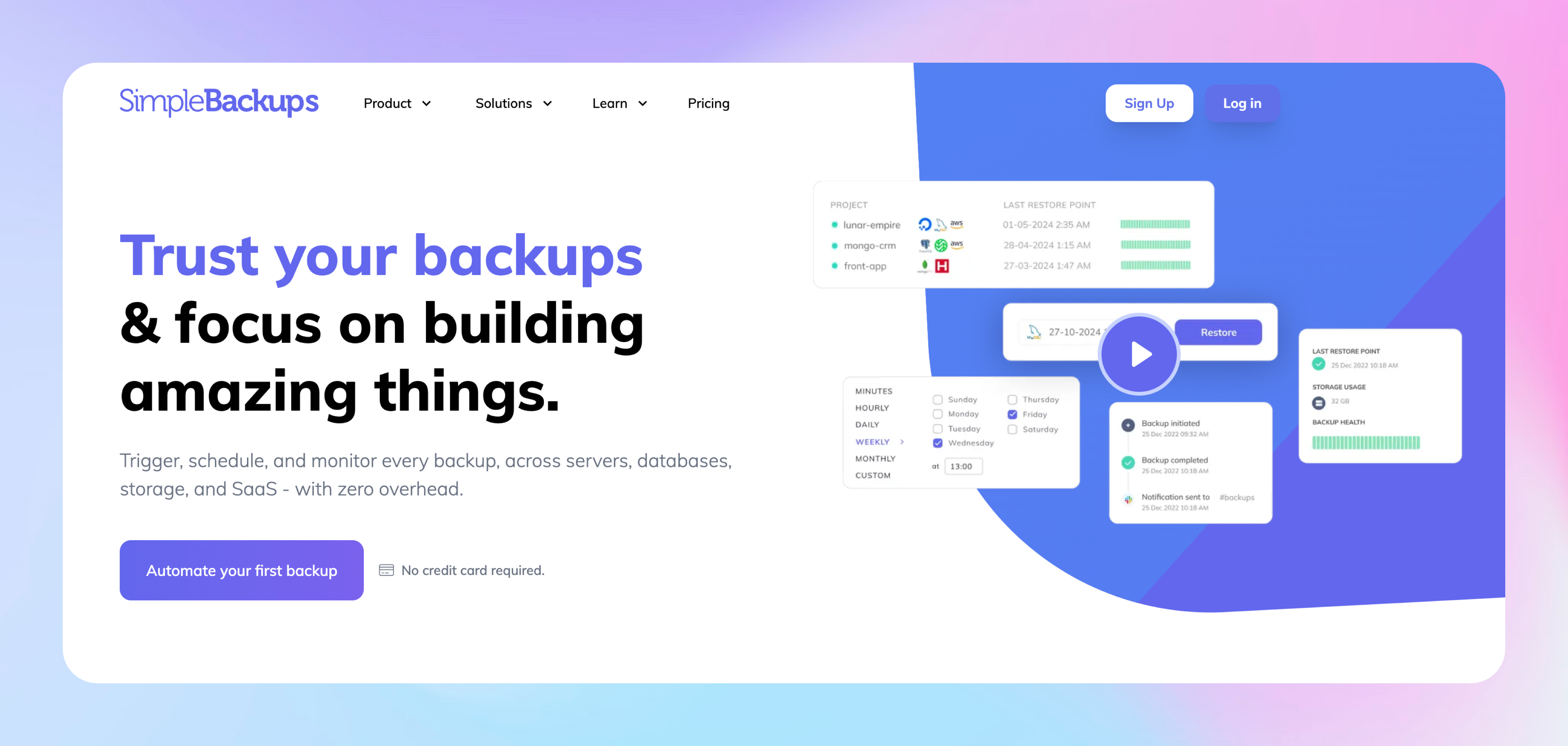
I'll be honest – when we started this redesign, we faced a difficult truth: our users weren't connecting with walls of text describing features. We needed to show, not just tell.
This realization transformed our approach completely. We've embraced visual storytelling as our primary communication method, with:
- In-app videos that showcase real workflows – allowing you to see exactly how SimpleBackups handles your backup scenarios before you even sign up
- Custom illustrations for every key concept – we spent countless hours ensuring these visuals actually clarify complex ideas rather than serving as mere decoration
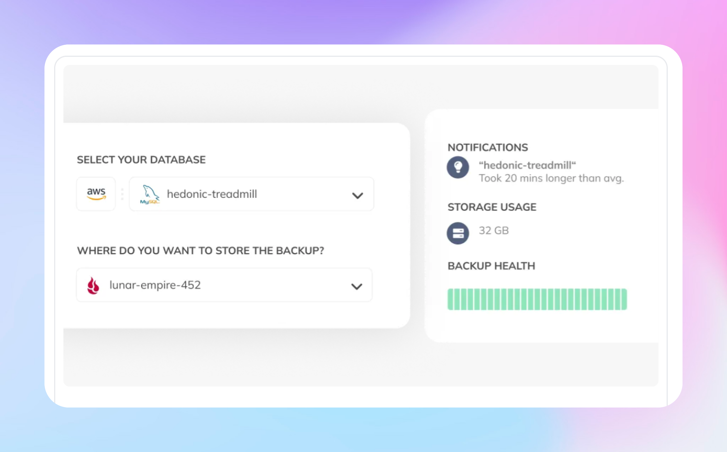
- Strategic screenshots that reveal the interface at critical moments, carefully selected to answer the questions we kept hearing from users
- A modern, breathing layout – we've significantly reduced text density and increased white space, letting important elements shine
Beyond Aesthetics: Tailoring Content to Real Needs
When we stepped back and looked at how people were actually using our site, we realized something important: one size doesn't fit all. Different audiences come to us with unique problems, technical backgrounds, and decision-making processes.
This insight led to one of our most significant shifts – moving from generic product descriptions to tailored experiences for specific audiences and use cases:
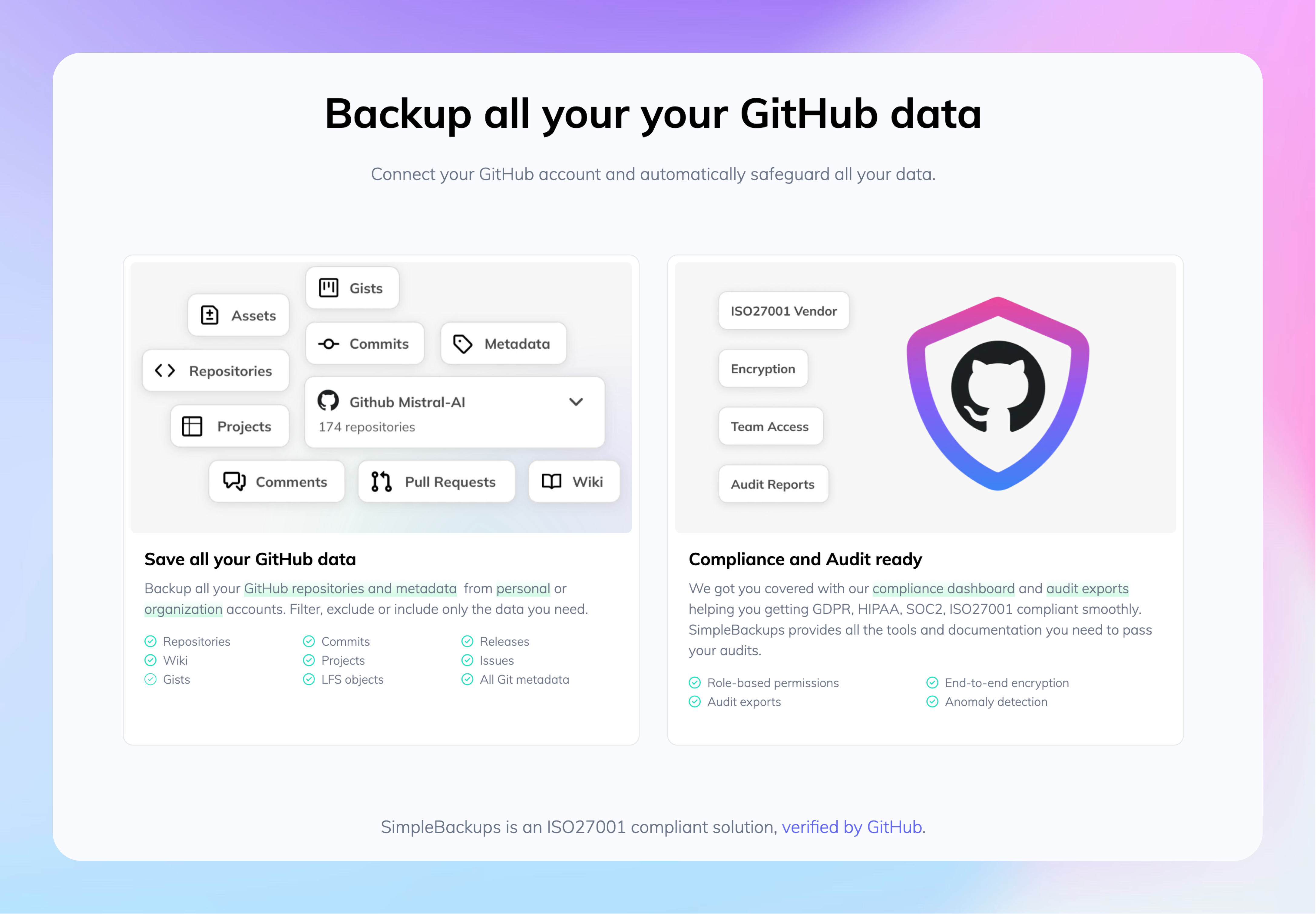
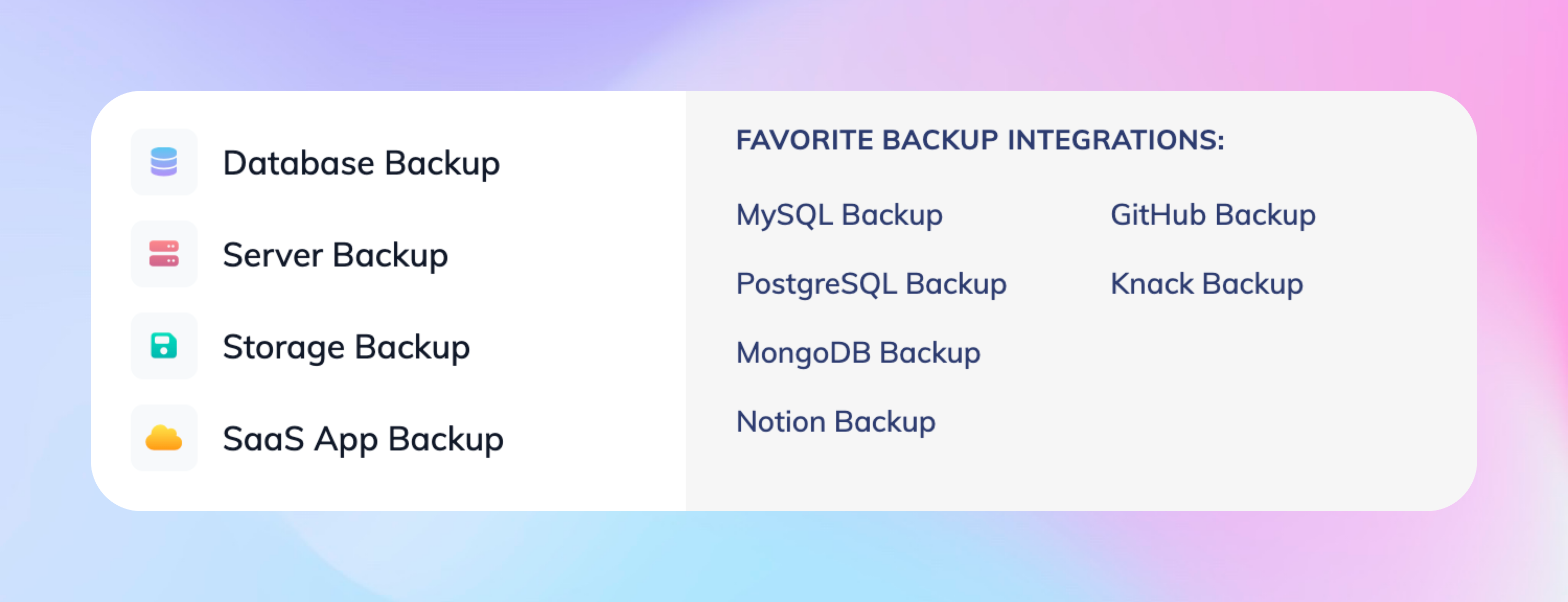
For Our Core Products, we completely reimagined pages for our most popular integrations like Notion, MySQL, and GitHub. Gone are the abstract feature lists. Instead, you'll find: illustrations, screenshots, videos ...
For Different User Types, we created dedicated pages for the three distinct groups we serve: developers, startups and enterprises. Each persona has its concerns, needs and level of knowledge so we tailored these pages accordingly.
Improved Security page and related content
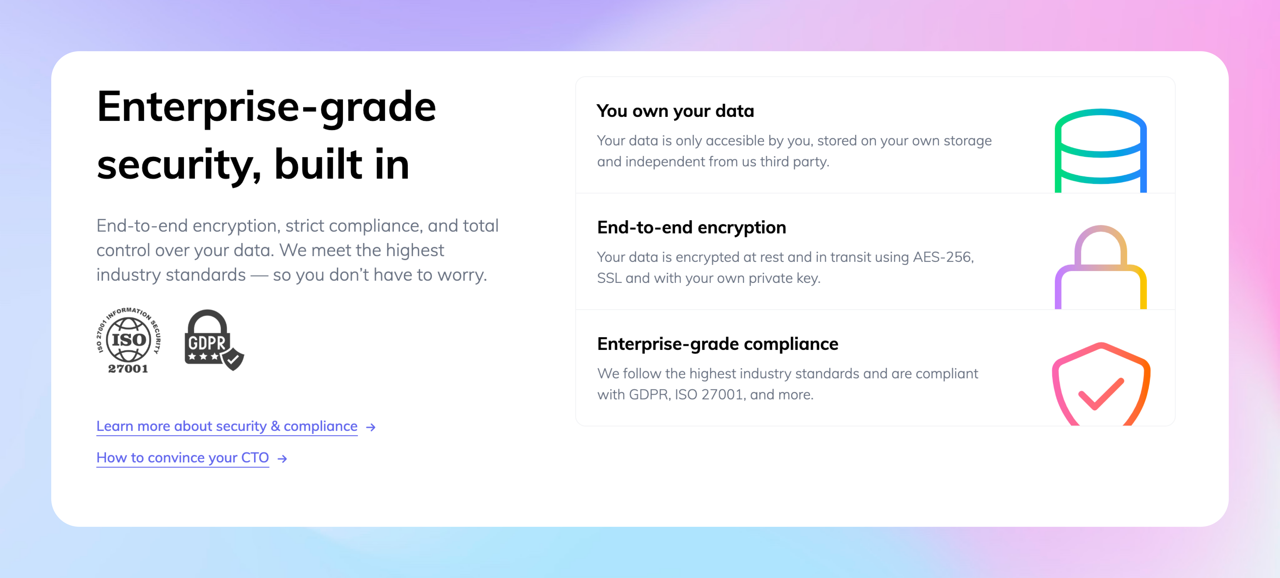
Security features have always been robust, but we failed at communicating them effectively. The hard truth? Most visitors skipped our security page entirely.
We revamped it fully, integrating content we had created for the "convince my boss" page together with content about our ISO27001 certification. We also integrated more of our security features on each product pages, including the most common questions people usually asks our team when they reach out to us via chat.
Side note for the techies: we moved to NextJS
Moving to NextJS wasn't initially in scope for this project – it emerged from a frustrated late-night Slack conversation that started with "What if we just...?" The question turned into a weekend experiment, which evolved into a full migration plan.
The most profound change wasn't technical at all – it was psychological. The website transformed from a burden we avoided touching to a living canvas we're excited to improve. When a user points out something unclear, we fix it immediately instead of adding it to a growing backlog of "things we'll update when we have enough to justify a deploy."
Looking back, our biggest mistake was tolerating technical friction for so long. The migration took less time than we'd spent collectively complaining about the old system. Sometimes the best technical decisions aren't about chasing the newest framework – they're about honestly assessing what's slowing your team down and having the courage to make a change.